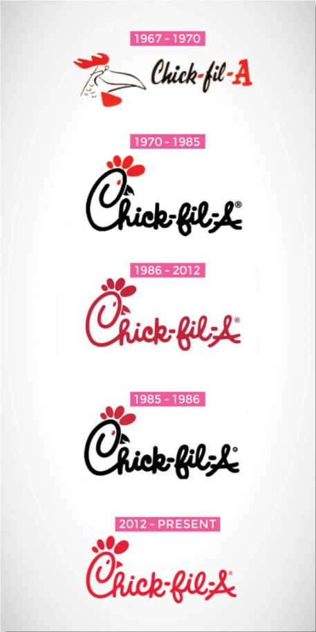
As you all may know, Chick-Fil-A is best known for selling, well.. chicken of course. It all started in 1946 when S. Truett Cathy opened up a small diner, and without realizing, would soon expand into more than 1,800 restaurants in 40 states and with over $5 billion sales in 2013.
It all started with the name. It originated from the Grade-A chicken fillet, soon making his restaurant brand so famous one day. When Mr. Cathy created the chicken fillet, it was so great he gave it the grade A. That is why in the original logo it gives the sense of a school letter grade, showing its credibility. Since Chick-Fil-A is best known for their chicken, what is easier than clearly represented the main product in your logo, the chicken. That is where we see the first step of the evolving logo in 1967. As you can see throughout the years, and soon after Mr. Cathy passing, the logo began to simplify itself. It was very transparent to keep the original logo of a full chicken head. Quiet frankly, some say that if Chick-Fil-A was still using their original logo to this day, their company would not be as popular as it is. Which I can see why; As years go on the design gets easier. What I mean by that is, a quick glance at the logo, and you automatically know what company is and what they sell.
In the beginning of the years of Chick-Fil-A, the design of the logo leaned more to the colors of black and a hint of red. As they changed it to fully red, I believe that it is more pleasing to the eye along with being cohesive. Too many combinations of colors can be tricky, especially for logos, so keeping it simple can leave a huge impact. Also, throughout the years they even simplified the beak, and it made all of the difference. It looked a bit odd with such a defined pointing beak that it was displeasing to look at. However, now that it is just a shape of a triangle, it does not stand out as much.
The font is also a great choice of design. Even though it is not simple like serif or sans serif for the viewer to read, it created it’s own personality. The curvy-cursive like font flows very nicely and gives the design an easy opportunity to create the shape of the chicken. Overall, Chick-Fil-A has done a successful job with their branding and popularity overall, and it all comes right back to the logo.
It is so interesting that Mr. Cathy gave his chicken an “A” for a grade because it tasted so good. I would have never thought that was the reason why the company’s title is spelled the way it is. This also explains the design choice in the first logo. The red A looks like it could go on someone’s homework.
LikeLiked by 1 person
I completely agree with your stance on that the simplicity of the logo is what makes it work so well. Every time they edit it, they change the detail just enough so it stays visual pleasing to the audience, but also that they never move to far from the original logo.
LikeLike
It’s really cool to see the change of the logo throughout time. Its interesting how the font never changes but the color of the text switches from black to red. I like how you mentioned that even though the text is not a simple font, it still gives a simple feeling. Chick-fil-a really did a great job branding themselves because now when I see that font I automatically think Chick-fil-a.
LikeLike
I did a Google search on the Chick-fil-A logo, and found this blog. I wanted to add some history here. When I was little my neighborhood was very close to Greenbriar Shopping Center Mall in Atlanta. My dad worked as a sales executive for Eastern Airlines in Atlanta, but every time the union protested, he was out a paycheck until they reached agreement. This happened often. During those strikes, my dad had to find other ways to make money to feed us kids. One of his jobs was working part time for a company that designed boxes. His task: design a box for the brand new chicken sandwich carryout place that had just opened in our mall. He designed a square box, and at the top he left two holes for the fingers — the chicken’s eye! Above the eye was the red crest of feathers. He showed us the box, which was then produced and used at the first ever Chick-fil-A at Greenbriar Mall, and he would often bring home those chicken sandwiches on his way home from Eastern Airlines. He worked at the box company only very briefly, and he never asked for nor got any credit for the box design. The restaurant later added hand plastic puppets that they gave out with their meals — with the same chicken logo. I have seen other people saying their dad created the logo, but I swear my dad did — because I remember him showing me the prototype box at our kitchen table. We ate at that tiny Chick-fil-A all the time — well, it actually only had two or three tiny tables — we carried the food home. Anyway, if there’s any way of verifying this with their corporate office, I would love to know!
LikeLike
Good description and all, but why would you (or whoever made the graphic) put the 1985-86 logo below the 1986-2012 logo?!
LikeLike
Why isn’t the change of spelling addressed here? I distinctly recall “Chic-fil-A”, not “Chick-fil-A”, and thinking that it was a strange abbreviation, since “chic” is another word altogether, meaning stylish. When the name was changed to “Chick”, I thought it was a wise move.
Anyone?
LikeLike