
Negro Abraham


The Super Nintendo Entertainment System (SNES) was released in North America in 1991. In 1990, the year before, the console was initially released in Japan under the name Super Famicom (SFC). Although the two products are made of the same internal components, their external features and marketing was different. Above, you can see the Japanese SFC on the left and the American SNES on the right.
Both consoles use grey colors for the majority of hardware, but the distinctive colors are different. The SFC has bright, colorful buttons on the controller and a matching logo on the console. It embodies the typical 90s electronics look. The SNES on the other hand, uses shades of purple for the controller buttons and features the purple color on the console’s buttons as well. It has a more modern design, with the added bump on top making it look sleeker. It’s been theorized that the shape is intended to prevent kids from leaving their drinks on top of the console, as obviously liquids and electronics don’t pair very well.


On the boxes, the Japanese SFC uses colorful lines and shapes to draw the console and its controllers, creating a visually appealing artwork. The American SNES has a picture of the console instead and emphasizes that the console is “super” by labeling it as such multiple times and including the title in many of its game titles, such as Super Mario Kart and Super Metroid. The SFC box art seems to be selling it as a new electronic device, whereas the SNES box art is more in line with typical American toy marketing, showcasing the console and trying to appeal to the kids and teens that would want the console.

In 2017, Nintendo released their latest console, The Nintendo Switch. Unlike with the Super Nintendo from the early 1990s, the Switch doesn’t have a different version for Japan. It still has a similar coloring style, with a solid color for the console and the bright colors on the controllers. The box art is much simpler, with just a picture of the console and the title/logo for the Switch. Since Nintendo is a very well known company now, they don’t need anywhere near as much marketing on the box.
Warframe is a fast paced Looter Shooter game, which first came to PC in March of 2013. It was released on the app Steam, which was and still is the main hub of PC gaming. When it first came out there was very limited content in the game, but it has evolved immensely over the years. When it first released, there were a total of 13 playable characters, respectively called “Warframes.” As of writing this in May of 2021 there are a total of 77 playable warframes. Of the cast that first released, only four of them were shown in their advertisements of the game.

Above is their original advertising for the game. The game has always been free to play, and as part of this they developed their original slogan of “Ninjas Play Free.” This was just a little joke since everyone was able to play free, implying that everyone was a ninja if they played this game. In the years since they have dropped that slogan, and changed the cover art of their ads dozens of times. It usually changes every time a new warframe gets released. Not every time though, because some updates are bigger than others. For example, this is their most up-to-date ad for the game.
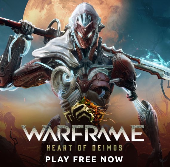
The ad has changed quite dramatically since their first one. It now only shows the warframe associated with the major update, instead of trying to cram all 77 into a single image. The game also gets a new subtitle for every major update released. Heart of Deimos is the one shown here. It was released in August of 2020, and added a whole new planet to explore, as well as Xaku, who is the warframe shown in the ad. Xaku however, is not the newest warframe. Since his release, two new warframes, Lavos and Savagoth, have come out. They were not part of any major update, the only thing added with their updates was mainly them. The banner art for the game itself on Steam does change with every new warframe and update, but not the ads themselves.
Their main focus on what they are trying to show audiences has shifted. In prior advertising their focus was on the fact that you would feel like a ninja while playing the game. Warframe prides itself on its fast paced action style, which has elements of melee combat, plenty of guns and weapons to choose from, and a high speed movement system to traverse the land quickly and in style. This is what gave them their idea for calling their players ninjas, because it was exactly what you felt like while playing. Now that the game is more well established than it was eight years ago, they seem to have harped less on that aspect of it. This might have to do with the paradigm shift of the standard of games in current day. Innovation of game mechanics is becoming less of a priority, and instead progression systems are becoming more popular. People like having incentives to play the game more, so companies have added Battle Passes to almost every major game. Therefore constantly updating the ads to show off new rewards, characters, and missions added is a higher priority.
Neither of the ads should be seen as bad, or lesser than others. They are evolving over time with the gaming industry as a whole. New times require new marketing strategies. It can be seen almost everywhere. Warframe has a great way of showing off their newest and biggest additions with cool looking graphics, but also making sure never to leave out the “Free-to-play” aspect of the ad.


The Evolution of Mickey Mouse
My family and I are big fans of everything Disney related, from going to Disney World to watching Disney movies. Growing up, as I watched Disney Channel I noticed slight changes to Mickey Mouse over the years of my childhood. I never realized how drastically they have changed him since he was created. The slight changes I saw made to him over the decade I spent watching, I never realized the extent of his evolution. When Mickey Mouse was first drawn and featured in cartoons, it was the early 1900’s and technology was nothing of what it is now. Viewed all the way to the left you can see he was drawn simplistic in black and white with little detail. There are hundreds of different Mickey Mouses because of the amount of cartoons, movies, shoes, etc. he was featured in. With each feature of him, he is bound to look a little different overtime, but throughout the years they made larger, more detailed changes to him. With Disney constantly coming out with new content for their brand Mickey Mouse (being their mascot) is always being altered. The second photo of Mickey Mouse is a perfect example of how he is changed by adding detail such as his hat. The third Mickey Mouse was one of the most popular versions of him, this version was when Disney World in 1970’s which gained much popularity. The fourth picture being the most recent version of Mickey which is the one I grew up on. Comparing the two photos of Mickey- first and last you can see the obvious differences such as color difference and size. But if you look closer at the original Mickey you see the big eyes, short shorts, and small shoes which is much different than present day. He now features bigger shorts, smaller eyes, bigger shorts, and many colors. These changes impacted the overall perception of Mickey Mouse.


Magic the Gathering is a widely known game, and is enjoyed by a vast variety of individuals. A deck building game with so many combinations of cards that you can summon any kind of beast, cast any kind of spell, or even propose to that special someone in the middle of the game with a very unique card. Over the years Magic the gathering has changed a lot not only playstyle wise, but also art wise. The changes to the art style since 1993 have been drastic, but necessary.
When Magic was first designed art wise, too much attention was put on designing the frame of the card. Designed to simulate a picture frame, very little attention was given to ease of gameplay. Choosing to use dark backgrounds with white fonts for the card names and illustrator credits, the difficulty reading them was immense as it is more difficult to read white text on a dark background then dark text on light. Reading difficulty was also increased by the font choice, the original artists chose to use the font Goudy Medieval. While a wonderful font for fantasy, it made it more difficult to read the already difficult to see text. Along with this, the darker colors were less eye catching, and dull. Though it shows great unity by pushing a real medieval feel with its background texture matching even through the text box, It draws too much attention away from the actual art on the card, and from the text. Along with this, the art on the card is minimal, and more cartoonish then realistic, with very little to actually see. Around it lines are put into place, creating a three dimensional frame, as if you were looking into it. This does add to the old ancient medieval feel, but adds more emphases on the frame, and less on what you are intended to be seeing. It also forces the art itself to be smaller in size, hurting the proportion of picture to frame. Though it does effectively use color to show a sun set, the islands blandness fails to give you any sense of scale for the size of the island itself, and damages the look of the image.
In contrast, the modern card fixes most of these issues. Replacing the dark background with a light one, and turning the text to black, you can clearly read what is on the card with no issues. Along with this, the font was switched to Beleren, which is much easier to read. Along with this, the frame distribution is greatly improved, leaving more room for the art box and rules box, as well as room for more text on the card. This improved version also focuses more heavily on the art of the card. Unlike the old version, your eye is instantly drawn to the art. Using vivid colors and angling, it appears as if you are standing on a high mountain looking down on this beautiful landscape, as the clouds move to partially uncover the sun in a bright blue sky, with slight ripples in the water, implying motion of the clouds and rivers, giving this world a real feel. The contrast between The cool blue water and the warm yellows and faintly yellowish green from the suns light also greatly adds to the beauty of this world. You feel like you have been whisked away into this beautiful serene world.
Not only was the art improved, but the layout of the frame was as well. As I mentioned previously, more room was left for text. With the main titles on the card in long rounded rectangles, it provides extra framing for the art, while also providing greatly improved organization. You know exactly where everything is on the card the second you look at it. The card name above the art, and the card type below, it very clearly separates the card into sections. This does not hurt the design however. Since the text boxes along with the art sport the same light blue background surrounded by a darker blue border, your eye sees them as important, and connected. because of this, instead of the box at the top of the image feeling distant and out of place, it instead pulls the image into a primary unit, designed to contrast with the grey and black border of the card, with the title boxes seemingly popping out ever so slightly with dark shading immediately inside the darker border, with the rest of the bordered sections having a darker inside on the left, and brightening on the right. This serves to provide subtle contrast on these borders, and though hardly noticeable, drastically change your view on the image. The grey rocky texture along the outside serves to provide a less drastic transition to black, making it easier on your eyes. The rules box also has replaced its text with its symbol instead. As this is a basic card, its rules are now implied, with no real need for instructions for even the newest of players. This blue goes along with the cards dark blue border, bringing it all together. All of this gives a wonderful sense of unity in this card. Unlike the old version, where the only real unity was in the main frame of the card, this newer version uses every element at its disposal to bring it all together as a unite. With improved proportion and organization, this card masterfully gives the feel that you really are looking at an island, while also being easily understood gameplay wise.

SpongeBob SquarePants is one of the most popular kid shows of all time and has impacted the lives of many people throughout the past two decades. Throughout my child hood, I grew up watching the television show SpongeBob SquarePants. I remember coming home everyday after school and watching it, as well as on the weekends. I would watch episodes over and over again. When they decided to make the first SpongeBob movie, I was very excited. When the movie finally came out, I watched that many times over too. I also had a lot of SpongeBob apparel. Needless to say, SpongeBob played a massive roll in my life. However, One thing I never noticed through my years of watching the show was that, there were many significant changes that took place to SpongeBob himself. As we can see in the two side by side pictures above, the SpongeBob in 1999, and the SpongeBob in 2019 look totally different from each other. SpongeBob’s earliest version was the picture to the left, and the picture to the right is the latest version. There were many changes that took place to SpongeBob in many different areas. One of the main changes made to SpongeBob was the difference in animation. In the picture to the left in 1999, SpongeBob was produced with cel animation. In 2019 SpongeBob was also produced with cel animation, however this time, the inking and painting of SpongeBob was done on the computer. This then led to many other smaller changes. One major difference in these pictures is proportion. Proportion plays a big factor in what makes these two SpongeBob’s different. As we can see in the picture to the left, SpongeBob’s head is much bigger than the rest of his body and it almost looks out of control. In the picture to the right however, this is a different case. We can see that SpongeBob’s head looks more like a solid square and is very nicely proportioned compared to the rest of his body. This also relates to unity. As we can see in the picture to the right, SpongeBob’s head and his pants are very evenly placed compared to the picture to the left. In the picture to the right, SpongeBob looks like a more unified square structure, compared to the first version of SpongeBob on the left. Not only does proportion play a role for SpongeBob’s head and pants, but it also plays a role in the smaller details. In the picture on the left, SpongeBob’s eyeballs in an unproportioned state. One is clearly bigger than the other. This changes however because in the picture to the right, we see SpongeBob’s eyes are more even with each other. We can also see this with his buck teeth. In the picture to the right, his teeth are much more even and more straight than the picture on the left. Another big change that took place to SpongeBob is the color of him. This is the one thing that many fans notice when watching different episodes throughout the years. Many fans actually did not like this change. In the picture on the left, SpongeBob is a very extreme yellow and it almost looks kind of dry. In the picture to the right, SpongeBob takes on this new brighter yellow. This yellow almost could pass for a lime green, making SpongeBob look like a highlighter. This contrast is a massive difference. This new color on the right also deals with emphasis. This brighter yellow, makes SpongeBob pop out at the audience more and it also catches the eye of the viewer immediately. SpongeBob’s transformation through the years, is very significant because he is an iconic character for many people all over the world. You could love or hate the changes made it SpongeBob, but the character overall, will live on forever!

Xenoblade Chronicles is a role-playing video game and part of the Xeno series. The Xeno series has a history of some of its entries being developed by Square, and others by Monolith Soft. Xenoblade Chronicles itself was developed by Monolith Soft and published by Nintendo for the Wii. The game just became a decade old just one year ago, as it released in Japan in 2010, but the cover art still remains timeless. This video game has a long story and has very complex in-game mechanics such as the combat system and customization. Some of the game’s strong points are its story, its characters, its huge, open world, and the engaging battle system. All of which create a memorable experience.
What makes the cover art so special is how well it depicts the powerful narrative of this game’s story. The story of the mysterious red sword on the cover called the “Monado” and threat of the “mechon” forces coming from the enormous, mechanical-like titan in the background known as “Mechonis.” The plot explores the main protagonist, Shulk, and how he discovers the capabilities of the Monado throughout the story, as he and the main cast aim to stop the struggle between the two titans, the “Bionis” and the “Mechonis”. Since everything in this cover art is meaningful, even the little scraps next to the Monado tell its own story; they are scraps of mechon parts. They could have easily left this out of the cover, but having it there shows more of how significant the Mechonis is to the plot of the game. The storytelling in this JRPG (Japanese Role-Playing Game) has captured the hearts of so many people, and this art captures it quite well. The Monado is placed in the foreground and is a good example of interposition. Moreover, the Mechonis in the background adds a lot to the enigma eminating from the visuals. It being very far in the background really gives an idea of how massive it is. To put things into perspective, the Mechonis has been proven by fans of the game to be much larger than Mount Everest. Moreover, the fog surrounding the Mechonis in the background makes for its ominous appearance, a detail that helps establish more meaning to the cover.
The cover art of Xenoblade strongly depicts the open world aspect of the game because the vast grassy field shown is actually part of the massive biological-like titan, called the “Bionis,” that people live on top of. The fact that this huge field is just a small part of the titan just shows how big they actually are. A big part of this game is exploration, and the cover art emphasizes how vast the world is.
The logo itself uses the typeface, Helvetica Neue Black Italic. The special design adds a lot to its appearance, and has its own particular style to it. Further installments of the Xenoblade franchise, Xenoblade Chronicles X and Xenoblade Chronicles 2 inherit this typeface and similar kind of art-style in their logos.
The logo style is very iconic to the franchise and really makes the installments stand out as “Xenoblade” games when glancing at the logos.


“A date which will live in infamy.” These words were spoken by President Roosevelt 60 years prior to this picture being taken. His words were in reference to the attack on Pearl Harbor by the Japanese Army forcing the US into WWII. September 11, 2001 will live in infamy. The United States was attacked by the Taliban kick starting a war that still rages on today.
This pictures shows three New York City firemen raising the flag in the wreckage of the fallen twin towers. Like the Marines of WWII who raised the flag on Mount Suribachi, these firemen raised the American flag. It is meant to be a symbol of hope and freedom. You may attack us, you may knock us down and think you have beaten us. The US does not give up that easy. These three firemen reassured the nation that day that we will get through this together. We must be united.
Such a beautiful picture came out of that awful day. You can see the smoke and dust rising from the ash in the background. The firemen bunker gear is covered in the dust from all the work they had been putting in that day. Something that stands out the most to me is the scale of this picture. When you look at the three men they seem almost shrunk down compared to the debris and rubble in the background. This to me shows how massive the towers were. Because of the smokey grey background the American flag and men stand out against it all. They’re brought to the front and it is what catches your eye first. I know these types of details were not in the photographers mind when it was taken. I’m sure they just saw this event happening and knew it needed to be recored for historical purposes.
The events of this day and this picture in particular will be engrained in my mind forever. The brave men and women who risked their lives that day inspired me to take the paths I’ve taken. I found myself in Afghanistan. The place were this attack was masterminded and battled over. Twenty years later we are still there. This picture will always be a symbol of hope and freedom for all in my mind.
When we see logos, they are meant to catch the attention from potential costumers. They have the power to bring in or repel costumers from buying the product. One of the most iconic and well-known logos in the world, for example, is Coca-Cola. Their products are one of the most widely consumed sodas ever. This is due in part to their logo, which they have had since about 1887. People see the logo and automatically know that they are getting a quality drink that has been around for almost two centuries.
The iconic semi-cursive font of the Coca-Cola logo gives it a “continuous movement,” as the Gestalt Design Principle states. We see it as one image as opposed to just the words. They are grouped together to make it move even better. It also flows in general, exemplifying the synchrony of Gestalt Design Principle, which also adds on to the continuous movement stated before. You can also notice the size of the letters are for the most part the same, even though we clearly see two capital C’s. This is the example of similarity to further relate the letters and make it into a logo instead of a brand name. Another example of Gestalt Design Principle is the use of color. Coca-Cola is notorious for its bright red designed letters or background. This letter is now associated with the brand. We see a red wrapper around a soda bottle and instantly relate it to Coca-Cola. Looking throughout the years and evolution of the logo, we also see with a symmetrical name there’s a symmetrical logo. There has always been four letters, C-o-k-e, on the far left, a dash in the middle, and four letters, C-o-l-a, on the far right.
In general, Coca-Cola’s simple logo design has made billions of dollars for the company throughout its many years in business. Constantly bringing in new and retaining current customers. It has proven to be effective and functional on all fronts according to the Gestalt Design Principle.

