Visual Analysis – Xenoblade Chronicles Cover Art

Xenoblade Chronicles is a role-playing video game and part of the Xeno series. The Xeno series has a history of some of its entries being developed by Square, and others by Monolith Soft. Xenoblade Chronicles itself was developed by Monolith Soft and published by Nintendo for the Wii. The game just became a decade old just one year ago, as it released in Japan in 2010, but the cover art still remains timeless. This video game has a long story and has very complex in-game mechanics such as the combat system and customization. Some of the game’s strong points are its story, its characters, its huge, open world, and the engaging battle system. All of which create a memorable experience.

What makes the cover art so special is how well it depicts the powerful narrative of this game’s story. The story of the mysterious red sword on the cover called the “Monado” and threat of the “mechon” forces coming from the enormous, mechanical-like titan in the background known as “Mechonis.” The plot explores the main protagonist, Shulk, and how he discovers the capabilities of the Monado throughout the story, as he and the main cast aim to stop the struggle between the two titans, the “Bionis” and the “Mechonis”. Since everything in this cover art is meaningful, even the little scraps next to the Monado tell its own story; they are scraps of mechon parts. They could have easily left this out of the cover, but having it there shows more of how significant the Mechonis is to the plot of the game. The storytelling in this JRPG (Japanese Role-Playing Game) has captured the hearts of so many people, and this art captures it quite well. The Monado is placed in the foreground and is a good example of interposition. Moreover, the Mechonis in the background adds a lot to the enigma eminating from the visuals. It being very far in the background really gives an idea of how massive it is. To put things into perspective, the Mechonis has been proven by fans of the game to be much larger than Mount Everest. Moreover, the fog surrounding the Mechonis in the background makes for its ominous appearance, a detail that helps establish more meaning to the cover.

The cover art of Xenoblade strongly depicts the open world aspect of the game because the vast grassy field shown is actually part of the massive biological-like titan, called the “Bionis,” that people live on top of. The fact that this huge field is just a small part of the titan just shows how big they actually are. A big part of this game is exploration, and the cover art emphasizes how vast the world is.

The logo itself uses the typeface, Helvetica Neue Black Italic. The special design adds a lot to its appearance, and has its own particular style to it. Further installments of the Xenoblade franchise, Xenoblade Chronicles X and Xenoblade Chronicles 2 inherit this typeface and similar kind of art-style in their logos.

Xenoblade Chronicles X’s logo is sharper and the “tech” aura portrays the style of the game just as well as the original Xenoblade Chronicles logo.
Xenoblade Chronicles 2’s logo, like the previous two, has the same typeface and style, but with its own variations. The flames added to the logo and the design and color of the “2” was a clever way of hinting towards an important part of its story.

The logo style is very iconic to the franchise and really makes the installments stand out as “Xenoblade” games when glancing at the logos.

The Monado is the main focus in the plot of Xenoblade Chronicles. The cover art draws attention to its importance with its red colors, contrasting from the rest of the visuals and emphasizing it greatly. The narrative creates this enigma of what the Monado means and its abstract power, so it standing alone in a grass field for the cover art makes its presence curious. The visuals in the cover art depict the story perfectly, and it draws questions that are answered in the game.

“A Date Which Will Live In Infamy”

“A date which will live in infamy.” These words were spoken by President Roosevelt 60 years prior to this picture being taken. His words were in reference to the attack on Pearl Harbor by the Japanese Army forcing the US into WWII. September 11, 2001 will live in infamy. The United States was attacked by the Taliban kick starting a war that still rages on today. 

This pictures shows three New York City firemen raising the flag in the wreckage of the fallen twin towers. Like the Marines of WWII who raised the flag on Mount Suribachi, these firemen raised the American flag. It is meant to be a symbol of hope and freedom. You may attack us, you may knock us down and think you have beaten us. The US does not give up that easy. These three firemen reassured the nation that day that we will get through this together. We must be united. 

Such a beautiful picture came out of that awful day. You can see the smoke and dust rising from the ash in the background. The firemen bunker gear is covered in the dust from all the work they had been putting in that day. Something that stands out the most to me is the scale of this picture. When you look at the three men they seem almost shrunk down compared to the debris and rubble in the background. This to me shows how massive the towers were. Because of the smokey grey background the American flag and men stand out against it all. They’re brought to the front and it is what catches your eye first. I know these types of details were not in the photographers mind when it was taken. I’m sure they just saw this event happening and knew it needed to be recored for historical purposes. 

The events of this day and this picture in particular will be engrained in my mind forever. The brave men and women who risked their lives that day inspired me to take the paths I’ve taken. I found myself in Afghanistan. The place were this attack was masterminded and battled over. Twenty years later we are still there. This picture will always be a symbol of hope and freedom for all in my mind. 

Visual Analysis of Coca-Cola Logo

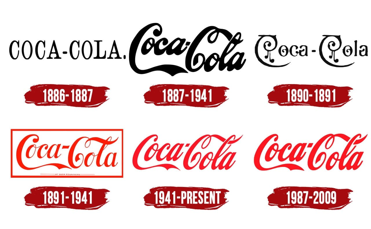
When we see logos, they are meant to catch the attention from potential costumers. They have the power to bring in or repel costumers from buying the product. One of the most iconic and well-known logos in the world, for example, is Coca-Cola. Their products are one of the most widely consumed sodas ever. This is due in part to their logo, which they have had since about 1887. People see the logo and automatically know that they are getting a quality drink that has been around for almost two centuries.

Download Coca-Cola (Coke) Logo in SVG Vector or PNG File Format - Logo.wine

The iconic semi-cursive font of the Coca-Cola logo gives it a “continuous movement,” as the Gestalt Design Principle states. We see it as one image as opposed to just the words. They are grouped together to make it move even better. It also flows in general, exemplifying the synchrony of Gestalt Design Principle, which also adds on to the continuous movement stated before. You can also notice the size of the letters are for the most part the same, even though we clearly see two capital C’s. This is the example of similarity to further relate the letters and make it into a logo instead of a brand name. Another example of Gestalt Design Principle is the use of color. Coca-Cola is notorious for its bright red designed letters or background. This letter is now associated with the brand. We see a red wrapper around a soda bottle and instantly relate it to Coca-Cola. Looking throughout the years and evolution of the logo, we also see with a symmetrical name there’s a symmetrical logo. There has always been four letters, C-o-k-e, on the far left, a dash in the middle, and four letters, C-o-l-a, on the far right.

Coca Cola Logo | The most famous brands and company logos in the world

In general, Coca-Cola’s simple logo design has made billions of dollars for the company throughout its many years in business. Constantly bringing in new and retaining current customers. It has proven to be effective and functional on all fronts according to the Gestalt Design Principle.

Michael Gemma – LeBron’s Dunk with Lakers


This is one of the most visually appealing photos in NBA history an might be one of the most iconic pictures in NBA history. There are so many factors that come into play when looking at this photo, one of the factors is emphasis. There is a great emphasis on LeBron as he is soaring in the air doing the Kobe Bryant style dunk that we all love and adore. Another factor that is present in this photo is the unity this picture has, You can see the list of retired jerseys, the NBATickets.com sign, and you can see the player and whole crowd watching LeBron soar in the air doing this sensational dunk. You can use many photos when talking about LeBron James, but I believe this is the greatest picture ever taken of LeBron in game. This image has a societal or period impact as well because this is an iconic picture of the most famous athlete in American sports doing something special, this image fits perfectly with our time period because the NBA is one of the biggest sports in the world and it’s greatest player ever has a picture of him doing a dunk that honored the great Kobe Bryant. LeBron’s dunk will be a historical image that we all can look back at when comparing this image to some of the all-time great images in NBA history. It’s an image that can connect with you personally because it is an image that strikes you as being special or incredible because every little detail in this picture is able to fully tell this story and make this image come whole. This image is pleasing to look at, it is visually appealing, you don’t have to be a sports fan when looking at this photo, this is an image that can tell a story in it’s self. It’s beauty is unparalleled, it’s importance is paramount, and it’s

Philadelphia Sixers – Tobias Harris

Many sports have been drastically impacted after Covid-19 occurred. Many players feel it’s harder to participate in a game without the support of the fans. One can imagine the players’ excitement when a limited number of fans were allowed access back into the arena. Players, such as Tobias Harris on the Philadelphia Sixers, definitely played harder with the fans by his side. The image shown portrays a golden ratio, having the main subject on the photo off to the side. By doing so, this creates an asymmetrical frame. There appears to be a slight color contrast as various individual colors stand out more than others, such as the black in the uniform which the home team is wearing. Although it’s an action shot, it is a still photo, not showing much movement. As a personal suggestion, I would have incorporated more emphasis on Harris. By doing something such as blurring out a background, more emphasis could have been left on the main subject creating a major difference. One can also create more emphasis by changing the balance. The size could’ve been altered so it appears that Harris is bigger than the surrounding players on the court. It would have also made a difference if fans were captured in the image. This would have allowed some unity making the individual fans apart of the bigger picture. This also would have been a nice touch because it shows how the fans support plays into effect when it comes to the players performance. Tobias Harris and the rest of the Sixers players have shown an astounding change in their performance ever since fans were allowed back into the arena and this is captured in the photo.

Visual Analysis Blog #1

Disney’s Frozen took the world by storm when released in 2013.  This icy tale of magic and love had young girls all around the world singing “let it go” on repeat, leading to the well-deserved and even more well-received sequel, Frozen II, released in 2019.  Frozen has become a household name, and a well-known story for both children and adults.  Pictured above is the book cover for Mari Mancusi’s novel Dangerous secrets, a companion book to the movie Frozen II.  The beautiful design of this book cover engages the possible reader into the story, while making it easy for all to recognize the connection between this book and the movie it is based off of.  Some elements that make this book cover so effective are the typography, the colors, and the recognizable artwork.  The typography of the book title is recognizable as being connected to Frozen, because it is written in the same font as the movie title, which is similar to a sarif font.  The font is also shaded to give it a dimensional look, drawing the eye to the title.  The colors are also a very effective part of this book cover.  Most of the book cover is blue, making the viewer connect the work with the cold.  To further this connection to the cold, there are snowflake shapes in some of the diamonds on the cover, and in the background behind and between the diamonds.  These diamond shapes are recognizable to anyone who has seen the movie Frozen II, as being the four spirits, and the layout of them is reminiscent of the “Show Yourself” scene in the movie.  Anyone who has seen the movie will remember the moments where these shapes and visuals are used, which helps connect the book to the movie.  The layout of the book cover artwork is visually appealing.  The spacing of the title is an example of the rule of thirds, as it is in the top third of the space.  The middle diamond, which shows the main characters of the book is in the center, also using the rule of thirds.  The brightest blue is used on this diamond as well, to draw attention to these characters and this moment that can also be traced back to being seen in the movie.  Ultimately, this book covers visual connections to the box office hit Frozen II, and the way in which these connections are presented create an effective book cover.   

Visual Analysis of a Cold War Infographic -Andrew Deegan

The Cold War Timeline Infographic - Jemully Media

The image that I have decided to use for this post is a timeline of the Cold War, a period of history that I personally see as very interesting and constantly expanding with new knowledge of past events. In addition to personal interest in the subject, the pursuit of a degree in history has also required me to study these events from time to time. While another topic may work best with an infographic based around numbers and other assorted data, I find that timelines are a form of infographic that is specifically tailored to the field of history.

Continuing, I’d like to address some visual criticisms that I have for this infographic, My first visual gripe for this piece has to do with those blue circles which seem to be merely placeholders for actual images; I feel that they are unnecessary. My second piece of criticism has to deal with the visual aides placed next to the information throughout the piece, generally they are insufficient and too unspecific to be appropriate for use with their companion information. For example, the use of a group of 10 stick figures for the section titled “Guerilla Warfare” is a poor representation of the subject, the image adds nothing to the facts.

This image, while I do have problems with it, does have some very interesting information pertaining to the span of the cold war, and the fact that it has presented a competent and comprehensive sampler of the period is a feat in it’s own. However, I would have liked to see the information complimented with better visual examples, perhaps the creator could have included charts which showed the rising amount of nuclear weapons in the world, or perhaps a world map which showed the influence of the soviet union throughout Europe. Overall, this timeline could use a visual makeover.

Visual Analysis- Avengers Movie Poster

Movie posters are meant to attract attention and engage the viewer as mush as possible. Artists accomplish this by using many different visual theory aspects. The Avengers series, from the Marvel Character Universe, has become one of the largest movie franchises of all time, so it only makes sense for them to use visual strategies in their posters to attract and engage as many viewers as possible. The Avengers: Infinity War poster is a prime example of such tactics.

This poster uses many Gestalt principles to produce a sense of unity in the image. You can clearly see synchrony from how the characters are placed in the same direction flowing down in the shape of a pyramid as well as outlying characters in the same place on either side of the pyramid. The pyramid shape is a great example of the Gestalt principle of Order and Symmetry, the characters in the movie are evenly placed on either side of the poster flowing downwards from the most important character of the movie at the top and the largest as well as the primary characters in the focal point of the picture. The principle of Similarity is seen through size, the largest characters are at the center of the pyramid and the smallest characters are seen at the bottom and the outside of the shape. This poster is almost the epitome of using gestalt principles, but that’s not the only visual tactics it uses.

Color is a huge part of this poster not only does it use contrast from the darkness of space to the light around each character. It also stimulates the way we see subjectively, it associates the cool colors for space because its dark and lonesome, and warmer colors around the color to show inspiration around them. One of the most important parts of the image is Tony Stark’s heart, it contrasts with the rest of the image because it is one of the most important parts of the entire franchise.

Indexal signs can also be seen throughout the poster. Thanos, the Villain of the movie, is the largest on the poster and the rest of the characters are under him. This represents that all the characters are united against him and that he is the main point of all their focus. During the movie he is also very powerful and (spoiler alert) he wins in the end because he is more powerful than all of them. Also its important to notice that the smaller characters with less of a role in the movie are placed on the outside and smaller than the more important characters.

Creating an image that attracts the eye requires organization and lots of thought. This was professionally done and it works perfectly. Its almost as good as the movie.

Visual Analysis Blog #1: A Different World-A Glimpse of the College Experience

Watch A Different World | Prime Video
By: Zora DeSeignora

It’s a Different World began airing on television in 1987 as a spin-off of the Cosby Show. This show has become my favorite television show ever (even though I was born in 2001) and was on of my many inspiration to attend college. The characters in the show depicted the life of college students at a fictional Historical Black College called Hilman College with different family and economic backgrounds. In addition to focusing on the college experience, the episodes also focused on real-life issues such as environmental issues, homelessness, date rape, racism and so much more. The characters and were not just college students, but they were activists, teachers, friends, and family. 

The photograph above is the cover of their fourth season and the interesting thing about this photograph is the use of colors. There seems to be a color scheme of red, yellow, black, white, and some gray. By putting everyone in similar colors, only avoids colors clashing, but it creates a unified look for the cast. No one looks like they are bigger than the others or the focal point, instead, they all look like they are important to the show (which they are!). Also, with the fading of the background, the people are pushed to the forefront, so the audiences eyes are directed to them. The photographer created a really interesting illusion to an oil-painted family portrait based on the placement of the light. There’s more light on the faces of the people than the background and outlining the heads and if you look closely, it seems it can almost be the perfect picture.

The multi-colored logo doesn’t clash with the rest of the photo either because of the white background. The typography of the letters seems like it was written by marker or chalkboard and the different colors work well together with the theme, as everyone is from a “different world”.

Visual Analysis – Carmela Falotico

The image I decided to post was an image about the awareness of anxiety and signs behind anxiety. During this time with the pandemic and the school being online, its a stressful time for students and the stress builds up over time. But people don’t even realized they are stressed with anxiety because a lot of people aren’t educated on the signs of anxiety. The design of the infographic shows the possible ways to recognize anxiety and how to notice the signs in other people.

The many ways that anxiety is recognized are often dismissed, which can make people feel as if their actions and thoughts aren’t valid to be considered “anxiety.” The way that the infographic uses the teal color in the image represents the significance behind the image because teal is the color of anxiety awareness.

Anxiety was often the disorder that was mostly ignored or considered “weak.” Having anxiety makes a person feel vulnerable. Mental illness is often dismissed and not taken seriously in some people who don’t show classic signs. For example, people who are diagnosed with depression don’t always show the full signs of sadness or lonesome. People with depression can often not show any signs, or can come off as normal. This means depression doesn’t always show as signs that people think are the norms. People with depression are often ignored and this goes the same for anxiety, but the signs can be minuscule and easily ignored.

If you have a friend and you believe they are struggling with anxiety, check up on them. Let them know they are not alone and that people are listening. Mental health is very important to maintain and needs to be normalized with society.