As with everything else in the world, logos have had to change and “get with the time” per say. Although companies may not have changed their names or their way of business at all, it is more than likely that over the past 50 years they have changed their logo a number of times.
Apart from companies, sports teams also frequently swap out logos for new ones in hopes of reigniting franchises. Just a few years ago, our very own Philadelphia 76ers went and changed up their logo and their jerseys in a brand overhaul. It is extremely common in this day and age to see teams change logos quite often versus back in the day when sports teams stuck with logos forever it seemed like.
Golden Sate Warriors Logo (Old vs New)
Whether its a logo for a large company such as Ford or a sports team such as the Flyers, old logos are being replaced by newer ones. These newer logos are more colorful, brighter, and have more of an attention of visual elements rather than business elements. More than ever companies want to sell you their product with their logo making them visually appealing to the eye.
Here a number of companies and how their logos have changed over the years
Here is an example of two similar visuals, with the newer one being brighter and more colorful.
The logo is the face of a company or a team. As a team or company decides to change its direction, that logo most likely will change with it. As far as I can see, logos will forever be changing and companies/teams will always be trying to improve upon them.
This is a vintage poster for the Royal Gorge, located in Colorado. It was originally used for advertisement but is now sold for decoration. When we view it, it’s easy to understand that it’s visually pleasing to the eye. The charismatic colors and pretty scenery are example of why it is pleasing to us as a visual. But why are visuals such as this poster pleasing, while others pass our eye with little notice. The visual theories we learned in class explain how we create connection and pick the visuals that gain our attention. For example, Gestalt’s theory is applied in this image because it contains common fate, similarity, and continuation through the railroad tracks repeating themselves and going back in the distance. Constructivism is applied in this image because the background has a few large, organic shapes in it. If these shapes were alone, we would not think much of it but when put together and the use of color, our mind automatically makes them into the water, sky, and mountains.
The Semiotic perceptual theory is applied in the signs located in the image. The poster as a whole is an iconic sign of the Royal Gorge Railway Route because it closely resembles the experience it is trying to represent. This image, even though not a photograph, has the same effect as a photograph because the realistic details to the actual experience and location. Otherwise, I did not see any use of symbolic or indexical signs in this poster. Lastly, the use of cognitive signs is prevalent in this poster. Since I grew up by railroad tracks that were right next to the river, this image brings back memories from my childhood. As well, this image applies selectivity because of its simplicity. I will remember the colors, scenery, and train from this image even after it’s gone because those are the significant parts of the image to me. The poster creates salience for me because my brother and I would run down to the railroad and put coins on the rain tracks and wait for the train to run over then. This was a very happy memory of mine and means this image has meaning to me when I see it. Lastly, this image shows the kind of culture in Colorado and the United States. The train ride and scenery of where we live is something we appreciate here and take value of, otherwise the Royal Gorge would not be a sustainable business.
Now let’s get to analyzing the visual. Starting with color, this image captures the viewers eye because it uses the complementary color scene of blue and orange. These two colors evoke different emotions to the viewer. Orange is generally associated with friendliness and being cheerful. Blue is associated with trust, strength, and dependability. These two groups of emotion are perfect to evoke in a viewer when trying to sell a train ride that goes right along a canyon. From the use of blue can make the viewer trust Royal Gorge train ride, that it is not dangerous, and the train is reliable. As well, the use of orange shows how the ride is kid friendly and how the staff and ride will have a positive impact on the riders.
The graphic also uses line movement and depth to keep the eye in the image. The train and train tracks create a leading line into the background from the foreground. As well, there are lines used in the rock and sky to add detail and shading in the image. Depth is created by the background being lighter shades of color than the foreground. The train is also following the rule of thirds because it is in a focal point spot. The horizon line on the bottom follows rule of thirds because it would be on/near one of the rule of thirds line, instead of being in the middle of the image. This image is shown from the viewpoint of straight on, which highlights the train and the beauty of where it is. If the image was shown from a higher angle it may seem scary to ride on, which shows the artist was smart when picking the angle and proportions in this poster.
The typography is unique in this poster as well and chosen wisely. The cursive, bold title without serifs creates an informal yet high quality impression. As well, the “route railroad” being in a serif straight font makes it easy to read and we as the viewer can understand what this poster meaning is. The font also matches many fonts we would see on railroad trains or at a station. With these fonts being related to trains it can have a positive impact on the brain. This is because trains in general are associated with positive memories, like playing with them as a kid, and therefore the viewer will have an internal impact due to the usage of font. Overall, this poster creates a calming and positive impact on the viewer and is a great advertisement for the Royal Gorge Ride.
This is a current image on used on their website for advertisement. It seems they have moved away from posters and graphic designed images and are using photography now instead. This allows the viewer to see exactly what they are getting from this experience by using real images, making it an iconic sign. It all shares the same leading lines back in the image to draw are eye towards the train. As well, this image focal point (the train), follows the rule of thirds. It also uses color to draw the viewers eye to the focal point because it is bright orange with lights, while the rest of the image is dark browns, grays, and green (creating a color accent). Lastly, the color orange creates the friendly and cheerful experience just like the original poster showed the viewer.
I would say this image is less successful than the poster due to it’s differences. To start, the lack of color and scenery outside the train give a poor expression of what the experience will be like riding the Royal Gorge. Not many people would want to pay money to ride on a train for scenery and only see walls of rock on both sides. As well, the image lacks movement of the eye and would not stand out when next to other images. This is because the leading line of the tracks draws the eye back to the train. After the viewer views the front of the train there is not much else to look at and the viewer will move on to the next image and forget the train fairly quickly. To add, the words “Royal Gorge” in a readable font and size should be somewhere in this image. A good place to put it would be bottom of the image because it is defocused and wouldn’t take away from the image as a whole. Overall, I feel as both images have qualities to them but the poster is the superior of images when trying to sell the Royal Gorge experience.
While not as prevalent in the personal computer’s, and by extension the operating system’s infantile years, the names “Windows” and “Mac” have become mainstays in contemporary society. While some relatively recent technology has seen its fair share of the spotlight, such as Linux, the two giants have been competing for potential customers’ interest for years.
Despite the usage of said operating systems, however, their features aren’t all that draw in users. Like most products, it all starts with a captivating logo. Nowadays, both the Windows and Mac (sharing its own from Apple) logos are immediately recognizable to most. However, this wasn’t always the case, and in their more obscure days, the companies went through a number of changes on their paths to becoming iconic.
Apple’s original logo seems completely divorced from the sleek ethos of its later incarnations, but with few examples to follow in the wake of, there was more experimentation through trial and error. The first result was something of a failure, at least by today’s standards. The silhouette is vague, with most of the recognizable detail stuffed inside the framing. The fidelity of the art, as well, lacks the striking simplicity that they would later come to be known by.
In contrast, the first Windows logo is one many remember fondly. The “window” motif is clearly presented by the four colored squares intersected with black lines, all within thick framing that fits the time period. It implies a sense of movement as well, the logo giving the illusion of a flag waving in the wind. The smaller shapes on the left complete the look, making the logo, and by extension the company, seem as if it is moving forwards, and ahead of the competition.
Moving onto the evolution of these logos, Apple clearly learned from its competitors in terms of simplicity. You will see the bitten apple on the backs of dozens if not hundreds of computers a day in any kind of urban setting, and the logo’s black complements any color combination desired. It’s hard to imagine the first logo belonged to the same company.
The same praise cannot be said for the new Windows logo, at least going by the impressions of thousands who mourn the loss of Windows’ more colorful identity. In embracing the “metro” style, characterized by sleek, lineless boxes, the logo takes a similar approach. It emulates the old with its skewed orientation, but with the lack of curve and trailing geometry, the life seems to have been stripped from this new identity. Despite the complaints over these newer redesigns, however, this wave of design seems to be sticking around for a long time.
Football and baseball have come a long way from our nation’s past to see them where they stand now. While the sports have both brought fun and enjoyable times to millions of people, they have both changed in a series of ways that have brought more safety to the athletes, as well as attractive and colorful designs that match the players’ uniforms.
While football has always been played professionally with pads to help reduce all the hits to the body, they had never used the helmets that we see players wearing today, and in fact, Leather helmets were the first type of helmets that were used by football players. The helmets themselves were never really attractive to look at even the slightest. Its dull brown colors were not meant to match the players uniforms and just stood as a simple protective headgear for the game of football.
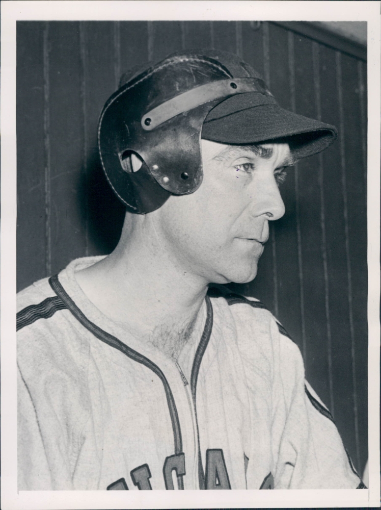
While baseball was never considered a physical sport, it sure became physical when you had a ball come gushing ninety miles per hour right towards your eyes. Sort of like the first football helmet, the first protective head gear for baseball was said to look like an “inflatable boxing glove that wrapped around the hitters head”. Though some players would wear basic, padded caps for protection, most would choose to forgo any extra protection. Just as the padded football helmets, batters helmets lacked the size to protect around the whole head and instead only protected the sides of the batters head.
The evolution of both helmets have grown in a variety of different ways, but visually, helmets have added color, durability, and excessive change in size which makes the game more fun and enjoyable.
In today’s game of football, rather than the small leather pieces of material we saw players throwing their heads around in generations ago, new material helmets consist of a hard shell, several inner layers of padding, and of course a face mask and chinstrap that have made the helmet material itself much more defined and durable. Rather than having their dull brown colors that did not seem attractive, helmets now use matching team emblems to represent the team that they play for. This is a huge part of the game that has driven in popularity for years with new designs and improved colors that have continued to change year by year.
As for baseball, while the style of the helmet hasn’t changed as excessively as football has, the colors have been changed to bring more attractiveness to the material. While it is just plastic material and carbon fiber composite, it does look whole of a lot better than the raggedy, old, “inflatable boxing glove” that was put around the players heads.