The Arizona Cardinals; a franchise that has never won the Super Bowl and a team that is known around the sports world for typically having a losing record every season. Suddenly there is a change in tone about this 2020 Cardinals team and there is buzz in Glendale. To the left is #1 Kyler Murray the No.1 overall pick in the 2019 draft this previous season, Kyler did extraordinarily well considering the weapons he had for the season. Kyler was still considered a ‘Lethal’ Quarterback winning rookie of the year leading his team to a 5-10-1 record. One of the only weapons he had was the aging future hall of fame wide receiver #11 Larry Fitzgerald however that’s not what the buzz in town is about. The sports world is raving about the new Wide out that the Cardinals have acquired from the Houston Texans, that is DeAndre Hopkins. In 2017 Hopkins had “0” total drops whenever thrown the ball, he is also #2 in all total receiving yard before turning 28 years of age with Larry Fitz coming in at #3. Hopkins is arguably the best receiver in the NFL right now; With Kyler Murray throwing it to either Hopkins, Larry, Christian Kirk, and Andy Isabella with Kenyon Drake in the backfield ESPN reports that the Arizona Cardinals will be “a force to be recon with” in the NFC Conference for the upcoming season.
What this poster means to fans is to simply get hyped and electrified for this season. The Cardinals have been low in attendance in recent years but will be sure to pack and sellout every home game this season. This image generates so much revenue for an organization which is ready to change its image in the sports world.
To the NFL the publishers of this image; I believe they are sending a warning. The AZ Cards hardily get covered by sporting networks and I think the league is ready to change that to send a message the Cardinals are back, and for all the other 31 teams standing the in the Cards way…. Get ready! They are coming!
Fast & Furiousis an American media franchisecentered on a series of action filmsthat are largely concerned with illegal street racing, heistsand spies. The franchise also includes short films, a television series, live shows, video games and theme park attractions. It is distributed by Universal Pictures. This specific movie poster of the 5th Fast and Furious movie has a very unique name. They portray “Fast Five” in very big and bold letters to show that the movie is action packed and violent. They use the “F” to spell out both of the words giving the title a more attractive and centering look. The three main characters in the movie are closer to the eye, giving you the idea that they are important people in this specific film. The background of the poster shows a bunch of characters from the movie around there cars and holding guns. The title of the movie blends in with the blue sky and clouds in the background. This gives a very flush and beautiful look to the poster.
Finding Nemo was and still is my favorite childhood movie. The movie poster consist of many things discussed in class about graphic design. Some things that standout to me are the choice of font, color scheme, and who the target audience is. The font choice is simple, bold, and wavy. I feel the designer used a font like this because it is a children’s movie so it simply stands out and flows with the water. They also used a fish as the center of the letter O with a wavy swoosh under it to give it an ocean under sea vibe. The different shades of blue in the water give the sea turtles a tortoise tint, making the turtles look good in the water and with Dory’s more royal blue color. Marlin stands out because he is trying to find his son the whole movie and they are both clown fish so they stand out in the big blue ocean. The target audience is obviously kids or families. Due to the fact that this movie is animated with talking sea creatures is why it is more of a kids movie.
Black Widow is one of the strongest, badest, and most talented female in the MCU franchise. She showcases a numerous amount of qualities that represent how powerful females are and what they are capable of if given the chance. She not only was in all of the avenger movies but she also appeared in movies with males being the main character. For example, she made an appearance in Iron Man 2, Captain America: Civil War, and Captain America: The Winter Soldier. With her being one of the main females in the Avenger movies, many young girls look up to her due to her willfulness and character. The ability to own the place when surrounded by men and still hold your own in a fight is amazing and inspirational.
On May 1st, 2020, Black Widow will finally be releasing her first movie ever to be made in the Marvel Franchise. This movie was long awaited and many are incredibly happy that this character is finally getting the screen time she deserves. Throughout the movie the character’s background will be shared which will allow the audience to receive a better understanding of her as an individual.
The poster gives off a dark but serious theme. The black background allows the color red to stand out more which draws the viewer’s attention almost immediately due to red being such a bold and broden color. The usage of shapes is also found among the red symbol. If you elaborate and look very closely, it is obvious of the triangles used. The little phrase “Nothing Lasts Forever” being placed on the red symbol was a very clever feature. The phrase stands out more against such a bright color when compared to black. I admire the way she is kind of walking through the symbol with weapons of some sort and a powerful stance that screams “I am not to be played with”. The outlining of her head being in the black background is a decent effect. It is quite unique how they incorporated that aspect into the poster to make it more interesting and appealing to the audience.
‘Jagged Little Pill’ a jukebox musical based on Alanis Morissettes album of the same name opened on Broadway in December 2019. Following a family who seems to be perfect in every way, each of them struggle with their own issues.
Considering the themes incorporated in the show their advertisements and posters are going to be more simplistic. Although still they are meant to persuade by trying to shows ‘slice of life’ aspects. The primary audiences are going to be theater goers and those who pass by the theater on the street. Both the poster shown above and below incorporate no forms of persuasion.
The color schemes for this show are a light blue and different shades of orange. Blue and orange are complimentary colors that make the posters very visually appealing to look at. In the graphic design especially the own shows below uses imagery. Each of the hands represents a sign and meaning. From left to right the hands stand for resist, pray, peace and connection. Each signifying the deeper themes that are portrayed in the production. The poster shown above uses typography in an interesting manor. The main title and subtitle of the show are all lowercase in an almost handwritten font. Then the name of the show written on the palm of the hand is all uppercase and bold. Finally behind the hand they have in a typewriter font music lyrics that draw your attention and makes you want to find out what is written.
In each of these respective posters the lighting is very natural, but also is usually brighter on the middle upper part leaving the bottom slightly shaded. With the poster show above they use a lot of squares to frame the title and a circle behind the hand to lead your eyes toward the hand and the bold writing on it. The bottom poster does a great job of framing the hands letting the darker skinned ones be on the ends to make it more visually appealing and give it more unity.
All in all both of these examples of ‘Jagged Little Pill’ posters are very simplistic and allowing more the appealing look of the colors, shapes and imagery shine. While that may be the interpretation of the posters the show itself is very complex dealing with a ton of social issues in todays society. Bringing a very real powerful outlook onto the world both with the story and the music.
The Naruto series is a Japanese Manga created by Masashi Kishimoto . The series revolves around the story of a boy known as Naruto Uzumaki; who has the dream of being the strongest in his village. Also known as the Hokage. Within this series Naruto contains the powers of a demon fox. This creature that lives within Naruto takes quite the disliking to him towards the beginning and middle of the saga. This idea of the fox is displayed in the poster above ;showing the cunning and evil based on the depth in color and face expressions. The Unity of the orange color from the Text to the clothing to the background takes up most of the negative space in the picture. The typography emphasizes the difficulty it takes for Naruto to master the power of the fox. The circles surrounding Naruto represent the massive amount of energy that the fox contains. As the series continues Naruto eventually master’s the fox’s powers and they become close friends.
When it comes to difficult enemies and near-impossible boss fights, Japanese video game development company FromSoftware always hits the nail on the head. With some of their most well known series’ like Dark Souls, Bloodborne, and Sekiro: Shadows Die Twice, these guys really know how to challenge a player in a very fair way. If you end up dying on a really hard boss, it’s most likely your fault. The real “challenge” comes form learning the bosses moves and learning how to counter them and earn yourself a victory.
Not only are they good at making challenging games, they’re also very good at making beautiful worlds and adding life to the places and people you come across as you venture through the various landscapes of their games.
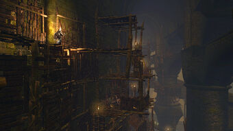
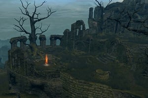
BlighttownAnor LondoFirelink Shrine
These are just a few examples of what their worlds look like. You know what’s surprising? All three of those locations are from the same game. Amazing, right? How all three of those locations are vastly different from each other – A decrepit old town collapsing in on itself, a beautiful palace in a kingdom of light, and the dark ruins of an old castle. The brown colors and dark shading in Blighttown tells the player that navigating through this seemingly vertical town will be arduous and difficult. The warm colors of Anor Londo gives the player a nice feeling of rest and rejuvenation at the halfway point of the game, and the green and gray colors of Firelink Shrine remind the player of loneliness and despair, but also giving them a place to call home.
Over time, FromSoftware has gotten better and better at integrating amazing art direction into every aspect of their games. As a more recent example, lets take a look at their most recent game Sekiro: Shadows Die Twice.
The Washington Redskins is the National Football League’s (NFL) sixth oldest current franchise as it was formed in 1932 originally as the Boston Braves, then formed to the Washington Redskins in 1937. Aside from the past ten or so years of mediocrity at best, The Washington Redskins has always been known as a historically strong franchise in the NFL. Many NFL Hall of Fame players such as Darrel Green, Art Monk, and John Riggins spent their careers with the Redskins along with legendary coach, Joe Gibbs. In addition to the team’s past success, the Washington Redskins were able to win three Super Bowls with five appearances. In the midst of their recent struggles, a bigger problem has formed with the big controversy of the team name and their logo. The term ‘redskin’ originally is a racial slur directed towards Native Americans formed in the 19th century, and their logo confirmed the organization was well aware of it.
Washington Redskins’ current official logo.
The colors are burgundy and gold as the burgundy is a darker red, implied to be the color of Native American’s skin.; the gold is just a nice, contrasting color to the burgundy. Aside from the colors, it is a very detailed logo with the image of a Native American Chief. To start, he has white feathers attached to his head to signify his authority, along with another tucked feather tying his hair across his neck. His face is detailed with small wrinkles to portray he is an older man, along with a stern facial expression showing he is prepared for war. The chief’s face is confined into a circular border to represent the team’s shared representation of the chief being prepared for war, in addition to two white feathers painted gold on the back of the circle similar to the chief to emphasize this.
Washington Redskins’ current alternate logo.
Since the recent controversy over the past ten years, the Redskins have refrained from using their official logo in public setting such as the scoreboard of their televised games, news channels such as ESPN and NFL Network, and merchandise. This logo is an ‘R’ obviously portraying the first letter of their name ‘Redskins’. The ‘R’ is created in a calligraphy-like font to represent the history of team being the sixth team created. Contrary to the official logo the ‘R’ is only gold, without any burgundy in it at all. This is because it is their secondary color, and what has led this logo to show up more frequently with the recent controversy with the representation of the burgundy color. Although this is not enough, it is a good start to the organizations’ slow process of coming to an understanding.
Movie Poster for the Re-Release of Indiana Jones and the Raiders of the Lost Ark (1982 Paramount Pictures)
Indiana Jones and the Raiders of the Lost Ark is the first installment in the Indiana Jones franchise, starring Harrison Ford as Indiana Jones. In the movie poster, Indiana Jones is at the center bringing the attention to him and the prominence he will have in the film. His stance implies movement, in part because of the whip that he is holding in his right hand. He looks to be in the middle of using the whip, with the whip being brought behind him. Our eyes follow the whip from the handle all the way behind Indiana Jones, creating more movement in the poster. Also, there is a snake in the background, and just like the whip our eyes follow the snake as it curls around the left side of the poster.
The movie poster also had great balance, with the two sides of the poster being evenly filled with characters and other content from the movie. The center has Indiana Jones, and directly behind him is the Ark of the Covenant which the movie is about. The other side characters and villains are on both sides of the poster, creating a balance between the right and left. The top and bottom are also balanced with the bottom having the lower half of Indiana and the Ark, and the top having the title of the movie in large letters making for an equally heavy top half.
Depth is used to help increase the level of balancing going on in the poster, with the characters being behind one another the further up your eyes go along the poster. At the forefront is Indiana Jones since the movie is about his adventure, and the reason for the adventure is right behind him in the Ark of the Covenant. This implies the importance of both showing they are critical to the story. Going up the sides are the side characters who play a part in the movie but may not have the largest impact compared to Indiana Jones.
Space is also utilized well in this movie poster. Across the main area of the poster there isn’t much space, aside from the space right behind Indiana Jones, which takes the shape of a circle, seemingly highlighting him and bringing the attention to him. There is some space between the characters, and things don’t feel crowded but there is still limited space available to fit anything in. Although on the outside borders of the poster there is a lot of unused white space.
At the bottom of the poster the names of the actors that are in the movie in important roles are presented in a very simple type, with not much creativity going into the type. This is used on purpose because the intention is to be focusing on the actual poster instead of the names of the actors and people who worked on the movie. Although this type is boring and not meant to be focused on, the title of the movie is. With the first word “Raiders” capitalized and in a larger text than the rest of the words, it comes as no surprise that people recognize this movie by simply the name “Raiders”.
All the different elements present in the poster work together to make it a great poster that does its job to get people interested in the movie.
Marvel movies have become a significant part of our culture today. With the release of every new Marvel movie, it seems like the movie sets a new record that was never achieved before. Marvel movies have been constantly setting impressive records are continuously becoming more and more popular. This has lead to the large development of a loyal and enthusiastic fan based who support Marvel movies.
Marvel movies have gained popularity for many reasons. The story lines are complex, interesting, and grabs your attention. The characters have extensive back stories, unique personalities, and are still relatable which help fans to personally connect with them while watching the movies. The complex story lines of each character are explained in their own separate movies while they also have the chance to come together in the Avengers movies to fight new battles together. Seeing friendships, rivalries, and competition develop between the different characters is captivating for the audience, wanting them to watch more and see how these relationships develop in future movies.
While the characters and story lines are crucial to the success of Marvel movies, another thing that continuously impresses the viewers is the visual aspects of the movies. Marvel has been known to have some of the best visual effects that have ever been produced to this day. Being able to develop and build the different worlds in the movie is an important element in order to bring the viewer into the story. While Marvel has been very successful with visual effects and the visual aspects of their movies, they have also been known to have visually stunning movie posters as well. Movie posters are important to try and convey the look and feel of the entire movie to a viewer in a single still image.
To demonstrate Marvel’s use of stunning visuals in posters, this poster is from Captain America: Civil War. There are a few things that immediately stand out to the viewer of this poster. First, the vertical balance of the image is very pleasing to the eye. On the left, we have Captain America’s head followed by various characters underneath him, who get smaller as they are further in the background of the photo. On the right, we have Tony Stark’s head at an equal size to Captain America’s. Again, Tony is surrounded by various other characters who are sized smaller as they move towards the background of the photo. The left and right sides of the poster are very equal and symmetrical , which catches the viewers attention. This is also a technique used to portray importance within the roles of the movie. By making Captain America and Tony Stark the largest elements on the poster, it implies that they hold a significant amount of the focus of the movie.
Another aspect that of the poster that is visually appealing is the use of contrasting colors. The left side of the poster is in a blue color theme while the right is in a red color theme. The two colors are split very clearly down the center of the poster. These contrasting colors helps to visually split up the two different groups of people. As the viewer, you may be lead to think why these two groups of people are split up. Are they in disagreement about something? Will they take two different sides in the movie and ultimately go against each other?
With these two groups of people very clearly separated on two halves of the poster, the space in between them naturally become a type of negative space. When the viewer notices this space between the two groups, their eyes will naturally gravitate to the middle of the poster. At the center of the poster, the movie title is written inside of Captain America’s shield. Then, it becomes apparent that the entire background of the poster is made to represent the shield, bringing even more interest to the movie.
Overall, Marvel and all their movies have seen great success since 2008, when the first Iron Man movie was released. While story line, character development, and relationships within the movie are crucial, there is no denying that Marvel has used another very important tool to gain their success: the visuals. The Captain America Civil War poster is a small snapshot at some of the visual tools and techniques Marvel has incorporated into their movies and images.